The Establishment of Doi Kham Logo
The Establishment of Doi Kham Logo
The Royal Factory scope of work expanded according to the principles of operation of The First and The Second Royal Factories; to produce and distribute products domestically and internationally under the trademark “Doi Kham.” The word Doi Kham was bestowed by His Majesty King Bhumibol with the trademark designed by His Serene Highness Prince Bhisadej Rajani (Former Chairman of the Royal Project Foundation) in 1978. In its initial stage, the trademark was used with The Royal Project Foundation.
In 1994, it was His Majesty King Bhumibol’s Royal Policy for the Crown Property Bureau to take charge of the Royal Factories instead of the Royal Project Foundation. The Royal Factories were combined and established as a corporate under the name Doi Kham Food Product Company Limited on August 8, 1994 to develop distribution and increase market expansion. The trademark was then modernized in 2000.
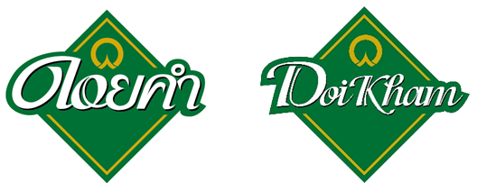
The previous logo was located at the highest position of the new “Doi Kham” logo (in the year 2000) in gold to represent the continuation of the His Majesty King Bhumibol’s Royal Philosophy. Under the previous logo was the word “Doi Kham” written in beautiful and delicate calligraphy. The uniqueness of the letter stands out in the green rhombic background portraying the characteristics of Thais.
Doi Kham is renowned and gaining wide popularity among health-conscious group of people, both domestically and internationally. The trend toward healthy and modern lifestyle has expanded from family type to younger generation and working group of people. These people have a distinctive and unique identity of being health-conscious and always open to good things in life. To attract this clientele, In 2016, Doi Kham’s logo has been redesigned to reflect the character of being modern, apparent, and easily accessible. The new logo is a transformation of the original logo back in 1972, inheriting the initial design that conveys the ideal of complete heart and soul embedded in all Doi Kham products.
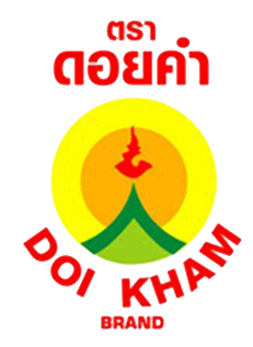
Doi Kham’s Logo Elements and Its Meaning.

Yellow-Gold Circle
portrays the sun, the father of creation whose power provides warmth and helps create lives on earth, signifying H.M. King Bhumibol whose reign has kept the people safe and warm and bring lives to all Thai people.

Dark-Green Triangle
symbolizes the green mountain of abundance, the counterpart of aridity. This signifies the achievement of change from shifting cultivation that disregards the environment to sustainable farming. Light-Green Gable depicts gable commonly found in Northern Thai style houses. It reflects the origin of the project and represents the Thai people. Light-Green Gable depicts gable commonly found in Northern Thai style houses. It reflects the origin of the project and represents the Thai people.
Light-Green Gable
depicts gable commonly found in Northern Thai style houses. It reflects the origin of the project and represents the Thai people.
Number Nine in Thai Character.
The figure resembles a drop of water signifying the drop of kindness from the King’s heart onto the mountain, bringing about fertility and abundance